
CEE Business Summit 2025 | Join the region's most prominent entrepreneurs and business leaders!
Menu
Pi2 is entering a new chapter by launching a refreshed visual identity. The rebranding – which features a modernized logo – reflects both Pi2’s maturity, built over 17 years in the Romanian market and 3 years regionally, and its current positioning: a Romanian-rooted agency with international presence, delivering strategic and creative solutions tailored to the markets it serves.
“This rebranding isn’t just about a new look. It’s a statement about who we are, how we work, and what we believe good PR should be: structured, yet flexible; creative, but purposeful. It’s our way of reaffirming both our identity – to our clients, partners, and ourselves – and our ongoing drive to connect people across languages and cultures in meaningful ways”, says Sandra Pitu, project coordinator.
The new visual identity was developed in collaboration with the Formr Agency team, under the creative direction of Ada Antofi.
“Pi2’s rebranding wasn’t just about creating a new logo – it was about shaping a visual identity that reflects who they’ve become: an agency with Romanian roots and a regional vision. The new logo speaks with clarity and warmth. It’s elegant without being cold, mature without being rigid. It’s an identity designed for a brand that knows its worth and chooses to express it with taste, not flash. For us, this wasn’t just another project – it was a natural collaboration with a team that knows exactly who they are and has the confidence to express it visually, with subtlety and precision”, says Ada Antofi, Creative Director at Formr Agency.
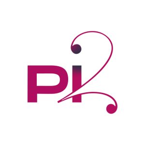
The Pi2 logo is made up of two complementary elements that reflect the duality at the core of both the team and the agency’s working style.
The “Pi” element, firm and structured, represents the strategic side – grounded in planning, clear direction, and rigorous thinking. These are key strengths in managing integrated campaigns for clients from diverse markets and industries, each with its own pace and demands. It speaks to the trust Pi2 has built over time, and its commitment to being a long-term partner – one who knows when to be firm, how to lead, and how to guide clients with clarity and vision.
The “2” element expresses the agency’s creative side – open, adaptable, and always exploring new ways to connect people from different cultures and backgrounds. It symbolizes the bridges built between East and West, the tailored solutions crafted for each market, and the human touch behind every message – the element that makes communication authentic.
This article was published in Business-review.eu.